Category: Uncategorized
Logo Animation
For my animated logo, I am going to use my restaurant menu/website, Tiny Travelers. I believe this would be a bumper for a possible television show about cooking for or with children that would be on the Food Network or something. The animations for other children’s shows and companies have a lot of the same characteristics: bouncing, wiggling, playing with individual letters, and including lots of textures and patterns. Some of the general ideas I have involve making the airplane on the logo fly, having the globe spin, or having the logo come out of a globe of sorts. I want to make it more exciting while not taking from the actual logo itself because I already have it applied to the menu and website. I think sound in the background is also important for this because sound attracts kids, so something like laughter or a plane “swoosh” would be fun.
Here is a picture of my working logo:


Mapping Info Graphic
For my mapping project, I decided to show my design process for a single project. This is a bit different from other ideas because it doesn’t involve a long period of time or a distance of any sort, but I think the process that I go through in designing a project is really unique. I have OCD, which is very much a part of the way I design from beginning to end, in researching and mind mapping, the start of production, down to the final product (examples: time spend mind mapping, number of times looked at Pinterest, programs used, total time on project, etc.). I would like to show this by taking a picture of myself, possibly the top of my head, and showing the process as a mind map of sorts above my head. I collected resources that I would like to mimic in concept and style. (Also, I’ll be titling my project “Obsessive Compulsive Designer”… I think, if that helps.)

This is an advertisement by one of my favorite companies, 160over90. It’s a series for The Athlete’s Foot shoe company which displays photos of athletes and sneakers and then has handwritten text featured over and behind them. I like how it interacts with the photo and seems like an integral part of it, not a separate entity. If the boy himself was illustrated, or the type was graphic, it wouldn’t have the same effect. I would like to incorporate handwritten text like this into my project.

I found a blog of entirely of pictures of organized objects that I LOVE. Once I have all of the information compiled, I would like to arrange it in this way. I think this reads really well and would be the easiest for whoever is looking at my project to understand.
Final Draft:

This is my final mapping project. I changed the title so it makes more sense, because a lot of the feedback I got said that it didn’t relate to OCD, just being organized and having an in-depth process. I also gave the colors meaning, green (aside from the title) are negative things, and pink are positive things. The information is all relative to my design process and how much I value the process. I think that anyone viewing this who doesn’t know me would be able to tell a lot about me by the photo and the data collected.
Quote Animation in After Effects

This is my storyboard for our quote exercise in After Effects. I am trying to keep it really simple because I’m having a hard time with the programs, so I thought to just make the quote on the right hand side, coming up quickly onto the frame one part at a time, pausing, and then continuing upward. The last part of the quote will then fade out. Storyboarding is actually helping me to figure out the timing and more structured parts of the animation which is what I’ve been struggling with, so hopefully I can apply it to starting the animation also. I added the background texture for some visual interest since the text will be all one color.
Here is my final video. I kept it relatively simple since I’m still getting used to After Effects. After I started lining up the times and using guides, it became a lot more familiar and easier to use. I realized that a problem I had before with not getting the text to remain static can be fixed by just deleting that keyframe and creating it over again.
Rhythm Exercise: Flash & After Effects
Our assignment was to make two animations, one in Flash and one in After Effects using the word “rhythm” to make a rhythm. This exercise was REALLY difficult for me, I’m finding that I don’t understand animation or really how to make it work the way I’m picturing it in my head. I tried following a bunch of tutorials online and tried to find how to make the video loop, but was confused by the language that was being used. After many attempts, these are my final products.
Flash:
Link to YouTube
Event Website: jQuery
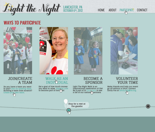
I am going to do my event website on the Leukemia and Lymphoma Society’s Light the Night Walk in Lancaster, PA. It is Saturday, October 6, 2012 in Long’s Park. It will be a 2 mile walk in which participants will raise funds for lifesaving blood cancer research. I chose the following “event” websites to use for inspiration for their functionality and style, I couldn’t find any that had any kind of similar event to what I chose. I am planning on using the same colors and themes from the original website to make the connection, but I hope to make it look more fun and stylish because as of now it’s a pretty boring website overall. I think having a nicely designed website for an event like this would really help people to get involved and participate.


I will have different sections throughout this one page website which will describe the actual event itself (time, place, map, etc.) and then the details of the event, such as what time to be there. I will have a section describing Light the Night and what the cause is about, probably at the top of the page. An area for the participants to register and sign up a team will be necessary as well.
My Objectives: The point of the Light the Night walk is not to be sad or mourn about lost loved ones or loved ones that are currently ill. Inspiration is the key to the walk and what the participants and volunteers involved try to achieve at every event. People associated with Light the Night are raising money to provide educational materials to patients and families and also fund local programs and support groups. The two mile walk, along with the other festivities of the evening, are meant to be about celebration. Celebration of the lives we have along with the lives lost to leukemia and lymphoma and those fighting for their lives. I want my event website to portray this more then anything, that this is a positive event about celebration and bringing awareness. Yes, your team is encouraged to raise money, but we all know that not many people have extra money nowadays, so raising awareness and education by about these illnesses by participating in the walk will be key.
Personas: These are the three personas I created for my event site about the Light the Night walk. I tried to think of three different reasons that people would be interested in finding out information or participating in a local walk and how I can use my event site to persuade them to be a participant or volunteer.


This first one would be basic, the main navigation staying fixed at the top of the page and when clicked on, the sections would scroll accordingly. I thought keeping the navigation visible the whole time is important for the user to be able to get back and forth from section to section and with this layout being the simplest I think it would be the easiest to use for the widest range of people.


This is stepping outside the box a little bit and trying to undertake a horizontal side scrolling layout. I like this concept because I had the idea to make the map of the route go along the bottom which I think would be really great for the user to see and interact with. The only problem I can think of with doing a website like this is it may be difficult for older users to navigate, I could always find one similar and try it out on older adults that I know to see how or if they figure it out.

Background/Nav:


I just changed some of the colors and patterns around here to see which worked better.

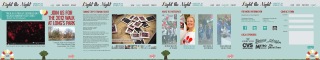

This is my final design for my website. The home page was giving me lots of issues but I think the solutions I came up with work really well. The footprints tell that it’s a walk without me having to write “WALK” anywhere (assuming someone would be viewing this website that wouldn’t know what Light the Night is). I kept in mind my personas the whole time and I think that the primary persona (the older woman) could easily be able to navigate and understand this site. I hope to include the jQuery features that I’ve designed. I think the simplicity of the map on the bottom was a good solution to the problem I was having of not making the illustrations match the rest of the page. The color underneath the map will continue down the page to symbolize to the user (if their browser is larger) that they are not able to scroll down but rather horizontally. I did design this keeping 1024×768 screen display in mind because that’s usually something I struggle with. I kept switching to check if everything could be seen, because for this kind of event there is a broad audience and I can’t expect everyone to have large format computer screens. Overall, I’m very happy with this website. I think it came together well and meets the objectives that I had stated at the beginning of the project; it portrays a fun event, although it’s about something serious it’s not a somber type of thing about mourning, it’s a celebration of life and a reason for the community, families, and friends to come together for a greater cause!


First Try at After Effects
Objective: Using only patterns and textures, and 5-7 words (centered, not moving), describe a dream you’ve recently had.
My dreams are a lot simpler then others I’ve heard of. Usually, I’m inside my own body, just walking somewhere. I’ve had dreams that my body looks different, but I’m always myself. For this project, I am using a frequent dream I’ve had of walking around a city. Not really going anywhere, just walking casually. Not being chased like many others dream about. I think this is a reoccurring dream lately because I’m hoping to move to a city after I graduate at the end of the semester. Also, I tend to dream in black and white. Sometimes even a very high contrast black and white. I think this is because I love old pictures of my grandparents and anything from “back in the day” and I think it would be so neat to see things the way society was forced to see them back then, much simpler. Our lives are so consumed with technology and stimuli that I think seeing things how those pictures are, in black and white, would be a good change of pace for a while.


Finished video sequence (link to YouTube)
NHTSA Info Graphic


404 Pages
For my 404 Error page I decided to do Animal Planet. Here is a screen shot of their existing 404 page:


I tried to go the more humorous route with these designs. I found the pictures and then came up with the ideas for the copy. I admit that it isn’t very strong, but I’m not very good at coming up with witty things to say, so I tried my best.

This last one was a completely different idea. It didn’t come out exactly how I had envisioned it. I had a really hard time finding typefaces to get the look I wanted and still did not completely achieve the look. I also had a hard time with the given colors of the site not standing out enough against the colors in the photograph.


Designer Site
The objective of this project is to build a one-page website about an designer or illustrator we chose from a list. I drew my favorite, Jessica Hische!
Research:
Jessica Hische is a typographer and illustrator and self-described “avid internetter”, working in Brooklyn, New York and best known for her personal projects Daily Drop Cap and the Should I Work for Free flowchart. After graduating from Tyler School of Art with a degree in Graphic Design, she worked for Headcase Design in Philadelphia before taking a position as Senior Designer at Louise Fili Ltd. While working for Louise, she continued developing her freelance career, working for clients such as Tiffany & Co., Chronicle Books, and The New York Times. In September of 2009, after two and a half years of little sleep and a lot of hand lettering, she left Louise Fili to pursue her freelance career further. Jessica has been featured in most major design and illustration publications including Communication Arts, Print Magazine, How Magazine, The Graphis Design Annual, American Illustration and the Society of Illustrators. She was featured as one of Step Magazine’s 25 Emerging Artists, Communication Arts “Fresh”, Print Magazine’s New Visual Artists 2009 (commonly referred to as Print’s 20 under 30), and The Art Directors Club Young Guns.


Jello Typeface

I’ve been itching to create my own typeface out of food… why not take on the hardest thing first, JELLO! Terrible idea. After filling my fridge with rainbow trays, I attempted to cut out the letters. The kitchen looked like a bomb went off. Little did I know, there are things you can add to the Jello before cooling it that helps it stick together. Oh well… now I know for next time.


