Back to Lancaster

Image

I’m proud to say that I’ve become part of the team at Godfrey Advertising in Lancaster, PA! I’m so excited for all of the possibilities in store and working with such a diverse team of people. In only my third day, I’ve gotten started on my first client-based project in which I’ll be able to use my full skill set and work at a fast pace with some of the great people I’ve met. After searching high and low all over the east coast for a position, I never thought I’d end up ten minutes away from where I graduated last year, but I don’t think I could be any happier with my decision.

Check out some (emphasis on some, these people never stop moving) of the work Godfrey does at http://www.godfrey.com!

Internship at Mission Media

For the past three months, I’ve been the Interactive Design Intern at Mission Media (check out their website at www.missionmedia.com!) in Baltimore, Maryland. Accepting this position meant packing up my things and moving from my suburban life in Reading, Pennsylvania, to a city that I knew little to nothing about; but I was excited for the challenge and the opportunity to learn something new about not only the industry I had been waiting to dive into but also about myself.

550182_259128380877062_365580493_n 579540_248571015266132_780422151_n 556341_266798406776726_503397882_n

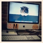
Starting at Mission, I was greeted by not only the staff, and not one, not two, but THREE office dogs which was a pleasant surprise!

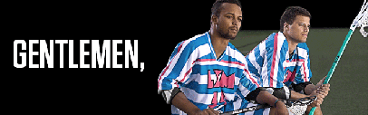
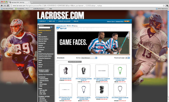
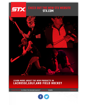
One of Mission’s biggest client’s is STX, a Baltimore-based sporting goods manufacturer. The first few weeks of work that I did was dealing with this brand. There were a few edits to be made to some already existing files for their upcoming Facebook and Twitter campaigns, not really complicated, but I did have to start familiarizing myself with the language of the brand and the sports it followed. I created an animated GIF for the “Game Faces” campaign and it has since been featured on Lacrosse.com, again simple, but I hadn’t yet made one in Photoshop CS6 so I did have to familiarize myself with this.

gamefaces

Screen shot 2012-11-20 at 11.12.54 AM

I was also given a spreadsheet of videos and content to input using Cold Fusion CMS which was tedious but I actually didn’t mind once I became used to the catalog of merchandise and terminology. It’s a very different way of looking at the deve

newsite-eblast

lopment side then what I’d been used to; I had only ever seen full markup, HTML and CSS, but the use of a content management system made things easier to an extent. I really do love code, the left-brain designer in me thrives on the organization of it all – either it works or it doesn’t work. The only part that was then complicated was if something didn’t work right the message had to be relied to the development team, it wasn’t something that I could fix myself. But it was a great introduction to Cold Fusion and I have since looked into it more.

Some other STX things that I worked on were a Hanger for a magazine that will be printed for the “Gentlemen” campaign, an e-mail blast for when the new website was launched, and some ideas for women’s lacrosse handle graphics for the upcoming Exult and Exult-10 high-end handles. That was a really great exercise for me to get my hands on when some of the other designers had been fresh out of ideas and needed some of us to share a new perspective. They are still in the process of reviewing, but hopefully my designs will make an impact!

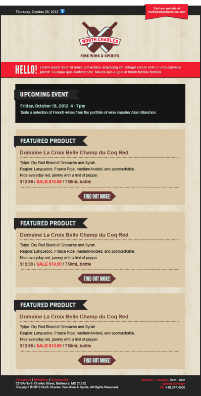
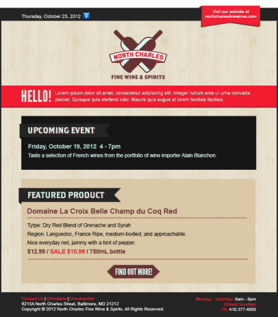
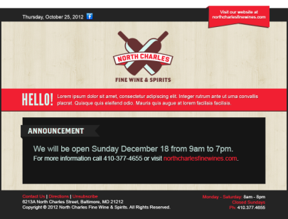
A larger project I worked on was for the North Charles Fine Wine company which is local to Baltimore. I created a few different e-mail templates that they will be able to use for their clients for different occasions. We went through numerous versions of templates because of the design of the website being changed at the same time, and I was also given very little information to build off of. They will be able to change the information within the template and it will be viewable on both Mac and PC formats with no changes.

Template3_wood

Template1_wood

Template2_wood

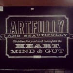
Internally, I was also working on a design for a Mission Media Client Support website that will be used to direct clients to videos, PDF documents, FAQ sections, contact information, and the chance to submit support tickets or inquire about new work. This had also gone through many versions and revisions and also mid-way through Mission had undergone re-branding of its own so I had to incorporate that into this design as well. I had to think a lot about the user experience, that the clients would be of all levels of familiarity with the web and what they would most likely be trying to find one an answer to one thing in particular rather than just browsing around throughout the site.

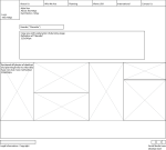
The last project that I only saw through the beginning stages was with a company called D3I, a Baltimore-based architectural firm. I spent some time doing research on the company and looking at other architecture websites, specifically going through some of the top rated firm’s websites to see what aspects they had utilized that we could take advantage of in our redesign. The next step was to create wireframes for what the layout of the site would look like. I was given a creative brief for what the client wanted so I knew what to do to an extent, but there were still some unanswered questions. I created two sets of different wireframes that had a different navigation. This is as far as I got in the process of this project as time constraints and other clients had come about; however I am excited to see the end result that the other designers at Mission come up with!

splashpage_v2 about_us_v2 who_we_are_v2 planning_v2 projects_usa_v2  contact_v2

My internship at Mission saw a lot of print work along with interactive – which I’m always open to. And luckily I had a classmate I graduated from Millersville with at my side who was also an intern there, who I got to see do some great work as well. So I think between myself and watching her I learned a great deal about working in an agency, the importance of communication, and how to enjoy yourself at your job. I’m really proud of myself for making the leap and taking this internship in this big unfamiliar city, and I hope it brings another amazing opportunity soon!

Exciting News!

Mission-Media1

I was accepted as an Interactive Design Intern at Mission Media in Baltimore, Maryland for the fall! I’ll be moving to the city this week for the next three months. Nerves are at an all time high but I’m so excited!

Be sure to check out their work at www.missionmedia.com!

My lifelong side project.


I don’t usually let my photography overlap my design work, but my best friend got married, so I feel it’s appropriate in this situation! I photographed he and his long-time sweetheart tie the knot, and it was absolutely beautiful. I find a lot of people often ask about my photo work, so here a is a link to their gallery on Flickr and to my other existing gallery.

Experimentation with CSS3

I’ve been experimenting on different ways to make e-cards using CSS3. I found a way to make a 3D cube that can be moved by using the arrow keys on the keyboard. Here are some screenshots of what I’ve created… a birthday “greeting card” using my monster illustrations.
http://erin-good.com/ErinGood_Ecard/monsters_ecard.html

The cube is created by using “faces” as div’s. The script uses 3D transforms with yAngles and xAngles. By changing the degree of the angle, the shape changes. In the CSS, the cube is transformed with rotateY (to get it to the right side of the cube where it belongs) and translateZ. I couldn’t really figure out how to manipulate the speed, must be set somewhere in the Javascript that I don’t understand

For the second card I created, I changed the letters using and manipulating the script Lettering.js. The letters each had a container and a span with different properties. I was able to set how the letters are in their regular state, and then transition, and transform states using skew properties, shadow properties, and color/font style properties. The speech bubble is an additional “CSS3 Trick” created with border properties to make the large curve of the bubble, the smaller curve of the bubble, the shape at the bottom where the two sides meet, and the white inside part of the bubble. There are standard properties like position, margin, color, etc. but there are more complex properties like z-index, position, and radius properties.

http://www.erin-good.com/TypographyEffects/index.html

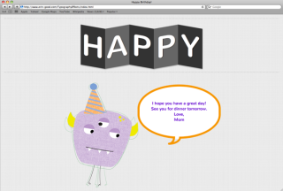
For the third card, I also used the script Lettering.js to create change in text. I could change the letters uses the same concept, but instead of manipulating the container properties, I created a mask for over the letters that creates a rollover type effect. There are also animation properties that go along with this effect, putting a delay on the animation changes the speed when the letters come in at the beginning and the rate at which they change when rolled over.

http://www.erin-good.com/TypographyEffects/index3.html

Title Animation Sequence

The movie I am using for my title sequence is Dazed and Confused. It was made in ’93 but takes place in 1976 and is about a group of high school students on their last day of school. They are big on their cars and “cruising”, smoking and partying, going to the pool hall and the moontower, and are all categorized into a specific group. There are the jocks who are becoming seniors, and it’s their mission throughout the whole movie to get ahold of the incoming freshman boys and basically beat them with home-made paddles. The girls who are becoming seniors have a similar hazing ritual for the incoming freshman girls who want to be a part of the popular crowd. The typical stoners. The smart geeks. You get the picture. Somehow they all party together and are intermingled to be good friends.

Possible Background Music:

Ted Nugent: Stranglehold (http://youtu.be/0c3d7QgZr7g)

Foghat: Slow Ride (http://youtu.be/GcCNcgoyG_0)

Here are two possible comps for the first few frames. They are very different styles, I’m leaning towards the first one because I think it represents the movie a lot better. The second one has a bit too much of a “That 70’s Show” feel.

I’ve been having trouble with thinking of an idea for the transitions between frames in order to keep the different colors and illustrations seperate but also linked together. I like the way transitions are used in this title sequence: http://watchthetitles.com/articles/0064-Le_Cactus, so I may take some cues from that.

I’m also a big fan of the Superbad opening title sequence (http://youtu.be/b5cMERD5S40). The transitions between the two of them dancing are more along the lines of what I’m trying to go for. Critics made comments about the 70’s feel to this sequence, the music and the colors used, alone with the simple style of animation – yet still completely appropriate for the film itself.

Here is my storyboard for my title sequence. It’s broken into parts because I could’t fit all onto one screen. I don’t have the timing lined up, I’m really unsure how to do it and I wanted to get some kind of feedback before I put the final touches on all of it. I’m also unsure if I want the words to just appear or if they should fade in. I’m overall really happy with it, I feel like it gives a relaxed 70’s vibe that follows the movie very well.

In-Progress Animation:
Final Animation:

This is my final title sequence for Dazed and Confused. I really couldn’t find a solution to the smoke illustration issue, I was spending too much time trying to find another object that could have the same illustration style and I couldn’t think of anything, so I just took out that section all together. I think rather then finding something that was an afterthought this was a better solution to the problem.

I really like the 8mm film effect that I put over the whole thing. I had some problems trying to fade in the music correctly but I think it works okay since it starts off instrumental. For not being really familiar with this program or animation in general, I think I did a good job and captured the essence of the movie.

Responsive Design

This is my mood board for my website redesign of the Cape May County Zoo. I would love to be able to use my style of illustration on this project, as well as using some really great photos of the animals at the zoo I found on the web. I want the website to appear fun, it’s at a beach so it needs to be appealing to people who maybe don’t want to spend every day on the beach in the sun, or have younger children and want another activity to do. My family and I frequent Cape May on vacation and we make it a point to go to the zoo every time we’re there so it’s a place close to my heart and it’s really a great zoo with a large variety of animals and activities that’s pretty underrated for the simple fact that it’s in a beach town in New Jersey.

Here are my wireframes for the Cape May Zoo website re-design. I used Simple Grid (http://simplegrid.info) for the layout, I’m not sure if I did it correctly though. The concept of the slots was easier for me to understand, but when it comes to it getting smaller I don’t know if I followed the format the way I was supposed to.

Home Page:

Desktop:

 Tablet:

 Mobile:

Subpage (Snow Leopard Project):

Desktop:

 Tablet:

 Mobile:

The main navigation switches from the left side to the top when the size is reduced from desktop to tablet, and then when it is reduced further to mobile, the icons that are along with the text in the nav will also disappear. The only other information that I made disappear is the Facebook and Zoo Friends information on the desktop version because this isn’t something that would really be necessary on tablet or mobile versions. In our practice website, I used a framework that had a responsive image scroller which I thought would look nice, but it may be a headache to develop. So instead I’ll just use one large photo with a type treatment of some kind. The current website has way too many pictures, although the animals are what draw people to the zoo, you don’t want them to see everything you have to offer before they even get there.

Here are my style tiles for my responsive design website on the Cape May County Zoo. I made them very different on purpose, I don’t know which direction I want to take the website in yet so it’ll be nice to hear feedback from the class. I like certain aspects from both of them though so a combination of the two might by nice. I want to keep the website clean and family friendly without making it too childish.

Updated Style Tile:

The feedback I received in class was that this style tile was much stronger then the other, the feel went more with what I’m trying to accomplish and was different enough from other website I’ve designed that it will be successful on its own. I implemented the textures from the other one with some changes in tone, and changed the botton a bit.

Here is my attempt at turning my wireframes into a working responsive design site. Coding manually is going much easier for me then trying to use a framework. I stared at Simple Grid for a few hours and it was just too confusing.

Home Page: Desktop

Home Page: Tablet

Home Page: Mobile

The sub page is giving me a bit more difficulty. I can’t seem to get an image to resize properly, even with copying the code directly from my homepage, which works correctly. Also, if I make the mobile size as small as it goes, the “more info” div seems to go behind the others which isn’t right and I’ve tried numerous things to fix it. Also, I’m not sure if the glitches that happen while resizing it are supposed to happen or not.

Sub Page: Desktop

Sub Page: Tablet

Sub Page: Mobile

Very happy with the progress of my responsive design website thus far. There are a few things on the subpage that aren’t working properly but I’m hoping with a bit of guidance I can get them on track. I actually found it refreshing to be designing right in Dreamweaver instead of making a mock-up in Photoshop, which was surprising for me.

Home Page: Desktop

Home Page: Tablet

Home Page: Mobile

Subpage: Desktop

Subpage: Tablet

Subpage: Mobile

The live website is available to view here. (resize window to see responsive properties at work!)

Portfolio Show Postcards

These are some postcard designs I created for our senior class portfolio show at the beginning of May. Each of us created designs and voted on the one that would represent our class that we could send out to family and friends.

I spent a long time thinking of a concept for my design. Our class is very diverse, some of us aren’t graduating until the fall, some have summer jobs unrelated to design lined up, and some of us are itching to get out and dive right in to the design world. I started thinking about my friends in the class and the struggles we’ve overcome this semester, and that all of us seem to be in a really good place right now. It took encouragement from each other to realize that we can make a career out of creating paper foldables, or cartoon characters, or animals with their insides falling out. We can do what we love, that’s enough.